Your Business Might Be Good. Your Website Just Doesn't Reflect It.
Your business may be better than your website makes it look. Learn how design, proof, and usability shape what potential customers believe about you.
 Trung Nguyen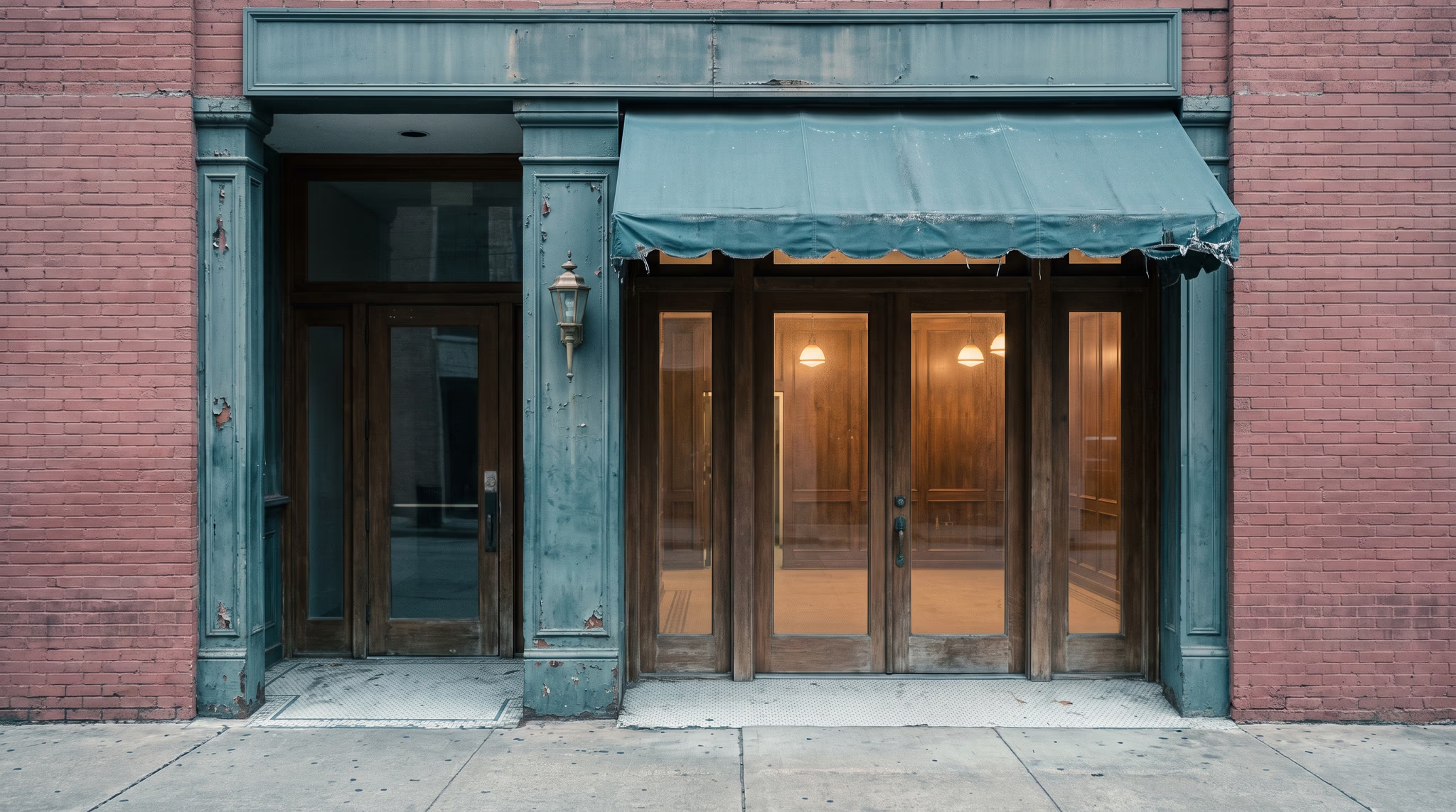
Table of Contents
Your business might be good. Your website just doesn’t reflect it.
That sounds harsh, but it happens all the time. A business grows. The work gets better. The team gets better. The clients get better. The standards go up. Meanwhile, the website is still representing a version of the company from three or five years ago.
You know the difference because you know the business from the inside. You know what goes into the work, how much your team cares, why your process is better, and what customers get that they won’t get somewhere else.
Someone who has never worked with you doesn’t have that knowledge of you.
They have whatever you put in front of them.
If your website is one of those things, then yes, it is shaping how they see your business before you ever get the chance to explain yourself.
People start judging before they know the full story
We do this with basically everything.
Walk into a restaurant and you notice the lighting, the cleanliness, the menu, the furniture, the way the staff presents themselves. None of that tells you exactly how good the food is, but it starts building an expectation before the first bite ever shows up.
A website works the same way.
Research on website first impressions found that people formed aesthetic judgments from website screenshots in as little as 50 milliseconds, with visual complexity and familiarity affecting how those pages were rated. That study was about visual impressions, not whether somebody bought something, so I wouldn’t stretch it further than that. The useful point is simple: people start reacting to what they see very quickly.
That’s why I don’t like the argument that “the work should speak for itself.”
It can, if people can actually see the work and understand why it’s good.
Imagine a custom home builder doing beautiful work, using great materials, obsessing over details, and charging accordingly. Now imagine their website has bad photos, outdated projects, broken links, and generic copy that sounds like every other builder in the city.
The owner knows the work is better than the website. A new visitor doesn’t.
You can’t expect people to fill in the blanks for you.
Your website is part of the proof
- If your website says you’re premium, I should be able to see something that supports that.
- If you say you’re detail-oriented, the website probably shouldn’t feel sloppy.
- If you say your process is simple, I shouldn’t have to click through six pages to figure out how to contact you.
- If you say your team is experienced, show me the people, the work, the knowledge, or something that gives that claim some weight.
Stanford’s web credibility guidelines make a similar point. Their research found that things like appropriate visual design, ease of use, visible expertise, real people behind the organization, and avoiding errors can all affect how credible a website feels.
I don’t take that to mean every website needs to look expensive or corporate. That’s another bad assumption.
A tattoo shop, law firm, gym, restaurant, and industrial company shouldn’t all be designed the same way just because someone decided “professional” means white backgrounds, dark blue text, and a serif font.
The design needs to fit the business.
My standard is whether the website reflects what you’re actually asking people to believe about you.
Stop asking only whether you like the design
This is where business owners can get too close to their own website.
You already know what everything means. You know why that project matters. You know why the company is different. You know what that sentence is supposed to communicate.
A stranger doesn’t.
So instead of only asking, “Do I like this website?” I would ask four better questions:
- What does this business look like it is worth? Does the presentation match the level of work and pricing?
- What does this company seem good at? Is that what you actually want to be known for?
- What proof backs up the claims? Work, reviews, people, process, results, credentials, something real?
- Does using the website match what the company promises? If you sell simplicity, does the experience actually feel simple?
Those answers give you information you can use.
“I don’t like this color” doesn’t tell me much. “We say we’re a high-end custom builder, but nothing on this homepage shows the craftsmanship” gives me a problem I can actually work with.
Use that information to help guide the work and hiring decisions.
Good design cannot cover up a bad business
There is a limit to this argument, and it’s an important one.
A good website will not save a bad product. It won’t fix bad customer service. It won’t make an offer people don’t want suddenly valuable. If the business is weak, making it look better only buys you a better first impression until reality catches up.
But the opposite is also true.
A strong business can make itself look average because the presentation never caught up.
That’s the part I think business owners underestimate. You can spend years getting better at what you do, then let an outdated website keep presenting you like you’re still the company you were when you started.
That doesn’t make sense.
Your website should be the clearest version of the business
Social media matters. Reviews matter. Referrals matter. Your sales team matters.
I still see the website as the place where everything should come together.
Someone should be able to land there and understand what you do, who it’s for, what makes you different, what your work looks like, and why they should take you seriously.
It doesn’t need to explain every single thing about the company. It needs to show enough of the right things clearly.
And because it’s your website, you control that experience. You’re not hoping someone sees the right Instagram post or trying to fit your whole company into a profile description.
My recommendation is to look at the gap between the business you’ve built and the business your website shows.
Maybe the problem is the design. Maybe it’s the photography. Maybe the copy is weak. Maybe the site is hard to use. Maybe the whole thing needs to be rebuilt.
Don’t jump straight to a redesign just because the website feels old. Figure out what isn’t matching first.
Then fix that.
Your business might be good. Your website just doesn’t reflect it.
If your website needs a redesign to catch up to the business you’ve built, schedule a call with me and my team at Desque.

Creative Director & Co-Founder
Leads creative direction: brand systems, visual identity, and the web design behind every site we ship. Makes Houston businesses look memorable, not just polished.
Related Posts
Launch Checklist
Work through this website launch checklist to verify every technical, content, SEO, and tracking item before you go live.

Fredy Rodriguez
Planning & Strategy
A good website planning guide stops you from paying to fix decisions you could have made for free. Here is what to settle before design work begins.
Fredy Rodriguez

Designing for small business: what your website is actually supposed to do
Most small business websites fail at their primary job. Here is how to design one around real goals: calls, form fills, and appointments, not aesthetics.
Fredy Rodriguez